
5 Ways to Make Your Blog More Mobile-Friendly
The number people using mobile devices to browse the web has gone up significantly in the past few years. A recent report by Forbes found that over half of all adults in the U.S. use smart phones. A significant percentage of them also use tablets or ereaders. As a blogger, you probably have a decent number of your online traffic coming in from some sort of mobile device. Because of this, it’s important to make sure your blog is mobile friendly.
What Happens If My Blog Isn’t Mobile-Friendly?
Do you remember the last time you looked at a website from your smart phone that wasn’t mobile-friendly? Websites that do not adapt to the new trend of mobile Internet surfing are much harder to read. You have to scroll a lot, or zoom in and out; pictures and videos can be difficult to view; and loading times take longer on a website that was not made to view from a mobile device. As a reader, you have to have a lot of patience to put up with that. Most likely, you left the website pretty quickly. If your blog isn’t mobile-friendly, you’re losing a lot of good traffic.
How Do I Make My Blog Mobile-Friendly?
There are actually a few options for making your blog mobile-friendly. Some of them will depend on the blogging platform you use; others will depend on your budget.
- Create a separate version of your website specifically for mobile devices. When someone visits your site from their smart phone, ereader, or tablet, they are automatically directed to the mobile version of your blog. It’s relatively easy and inexpensive. However, it’s also not a great option for a few reasons. When you upload new content or publish new posts, you have to do it for both types of websites. This is obviously more labor-intensive and time consuming. This website also won’t work for tablets – just smart phones. If your readers attempt to share your URL with their friends, desktop users will click through the link to the mobile website. Load time could be affected. And lastly, there can also be some significant issues with your SEO if you don’t follow Google’s rules for such instances.
- Build a website that has a responsive design. “Responsive design” means that the website is built using percentages instead of exact measurements. Choosing this method allows your blog to adapt to whatever device your viewers choose. This option is a favorite of Google’s and eliminates many of the problems of a separate website: you only need to publish content once and loading times also adapt to the device being used. However, the downside is that this type of website is more expensive to create initially. Depending on how old your website is, it might be impossible to convert it to a responsive design.
- Choose a blog theme that is mobile-friendly. Many WordPress themes now come with a mobile-friendly feature. They will automatically adapt to any mobile device. However, even the ones that don’t have that feature are still easier to view on a mobile device than a static website. Anyone who accesses a WordPress blog will see a mobile-friendly site, though it might not look the same as your desktop blog. That’s because your specific theme will not translate over; instead, WordPress has another theme that automatically applies. Blogger also has templates that are mobile-friendly. Using a theme that is mobile-friendly is easy to do, and you can do it without calling in for backup. It’s also inexpensive. The one downside is that you might have to change the entire look of your blog, or your mobile site will not look exactly like your blog. Look into individual themes and templates to find out more.
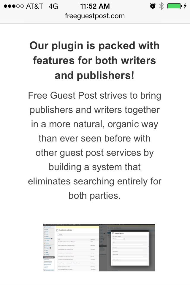
- Install a mobile-friendly plugin. One of the greatest parts about WordPress blogs is all the many plugins that are available. Fortunately, there are plugins that create a website accessible by mobile devices. The plugin also gives you the option of themes that are mobile-friendly. This is a great option for those who have had their WordPress blog for a long time. You don’t have to change your theme or your blog’s appearance, but you can still create a mobile-friendly blog.
- Adapt specific elements in your blog. If you want to keep your blog the same, there are a few individual parts you can change to still make it mobile-friendly. Try using smaller images that are easier to see from a smart phone without pinching the screen to zoom out. Smaller graphics also help cut down on loading time. Make your buttons larger so that they are easier for fingers on touch screens to press.
I’ve made my blog mobile-friendly. Now what?
Sit back and check out your analytics. Most likely, you had plenty of traffic coming in from mobile sources before you made changes to your blog. Compare how your visitor behavior changes after your adaptions. Is your bounce rate lowering? Are you gaining more mobile traffic? You may not see any major changes at first, but your readers are thanking you for making your blog easier for them to read.
What changes have you made to your blog to make it more mobile-friendly?
Sources:
Rogowsky, Mark. “More Than Half Of Us Have Smartphones, Giving Apple And Google Much To Smile About.” http://www.forbes.com/sites/markrogowsky/2013/06/06/more-than-half-of-us-have-smartphones-giving-apple-and-google-much-to-smile-about/. (5 Nov. 2013).
Brenner, Joanna. “Pew Internet: Mobile.” http://pewinternet.org/Commentary/2012/February/Pew-Internet-Mobile.aspx. (5 Nov. 2013).
Clearly, Ian. “How to Make Your Blog Mobile-Friendly.” http://www.socialmediaexaminer.com/how-to-make-your-blog-mobile-friendly/. (9 Dec. 2013).
Olson, Derek. “CHOOSING BETWEEN RESPONSIVE WEB DESIGN AND A SEPARATE MOBILE SITE TO IMPROVE MOBILE VISITORS’ EXPERIENCE.” http://www.foraker.com/choosing-between-responsive-web-design-and-a-separate-mobile-site-to-improve-mobile-visitors%E2%80%99-experience/. (9 Dec. 2013).
“Themes >> Mobile Themes.” http://en.support.wordpress.com/themes/mobile-themes/. (10 Dec. 2013).
Chan, Louisa. “How To Make A Mobile Friendly Blogspot Blog Site II.”http://www.louisachan.com/how-to-make-a-mobile-friendly-blogspot-blog-site-ii/. (10 Dec. 2013).
Sharkov, Daniel. “3 Simple Ways to Make Your Blog Mobile Friendly and Improve User Experience.” http://www.reviewzntips.com/mobile-friendly-blog/. (10 Dec. 2013).


Leave a Reply
Want to join the discussion?Feel free to contribute!